How to Incorporate Accessibility into Your Practice
AI assisted design
In health care settings, designing for accessibility is not only the law but shows that your space is welcoming towards people with a wide range of physical, mental, and emotional abilities. It requires a comprehensive approach and great attention to detail. The most applicable design considerations for the widest number of healthcare spaces will be addressed in this blog post; however, please consult an interior designer for your practice’s specific accessibility needs.
Universal Design vs. Inclusive Design vs. Accessible Design
Everybody is talking about Universal Design these days, and there is often some confusion about how universal design is different than inclusive design and accessible design. As defined by The Center for Universal Design at North Carolina State University,
Universal Design is "the design of products and environments to be usable by all people, to the greatest extent possible, without the need for adaptation or specialized design."
The researchers and designers at NC State have established seven principles of universal design: equitable use, flexibility in use, simple and intuitive use, perceptible information, tolerance for error, low physical effort, and size and space for use. An example of universal design would be sidewalks with curb cutouts. These benefit a wide variety of people from a mother pushing a child in a stroller to a wheelchair-user to an elderly man with a walker. Or the use of oversized chairs in waiting rooms. Universal design is not catering to any specific group of people but instead aims for one solution that fits the needs of everyone.
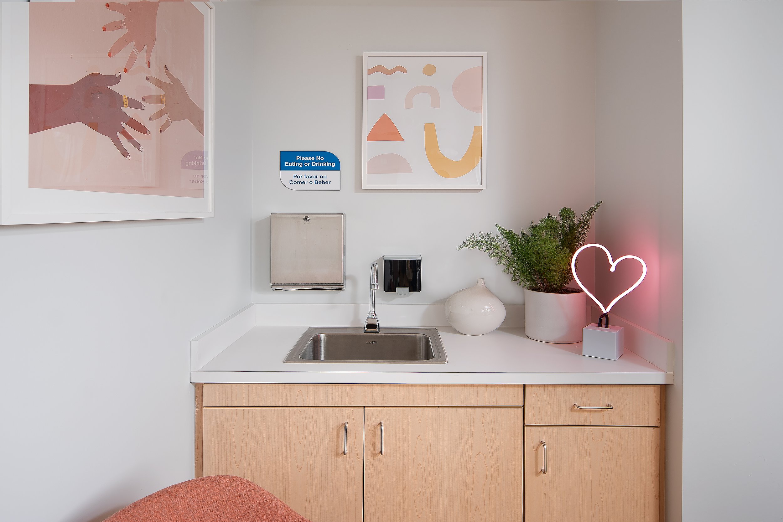
Inclusive design involves making design choices that consider personal identifiers, including ability, but also other identifiers, such as race, socio-economic status, language, age, sexual orientation, gender identity, and more. At Blackwell and Jennings, one way that we demonstrate inclusive design in every project is through the artwork we put on display. We ensure that marginalized and minority communities, like the BIPOC, LGBTQIA+, and disability communities, are uplifted in our curated artwork. Doing this signals to patients that your practice is a safe space for them and that they will receive compassionate care. An additional tip: be sure to highlight your staff’s identifiers too. This is their workplace after all, so they should be represented in addition to patients.
Finally, Accessible Design is different from Universal Design and Inclusive Design because it specifically addresses the needs of people with disabilities. This is the type of design required by the Americans with Disabilities Act (ADA) for all public facilities and services, including your healthcare practice. Examples of Accessible Design include installing grab bars in your restrooms at specific heights to accommodate wheelchair-users and providing braille on signage throughout your facility to accommodate blind patients.
The Americans with Disabilities Act and Your Practice
AI assisted design
Implementing ADA guidelines, as mentioned, is required by law in new build or major building renovations, but that doesn’t mean your space needs to look any less luxurious. Take this beautiful restroom concept, pictured to the right. This restroom balances naturally inspired finishes and sleek, modern amenities. Plus, it is 100% ADA-compliant.
We cannot give a comprehensive list of all the ADA requirements in one blog post, but here is a list of some requirements that are often forgotten:
Carpet or carpet tile shall have a pile height of no greater than 1/2” measured to the backing, and all edges shall be fastened to floor surfaces securely. It is not recommended to have any carpet pad installed underneath; however, if one is used, it should be firm. (ADA 302.2)
Objects can protrude a maximum of 4” from walls, partitions, and columns along circulation paths between 27” and 80” off the ground. This includes light fixtures, such as sconces, that are common in hallways. (ADA 307.2)
Door handles must be able to be used with one hand and cannot require tight grasping, pinching, or twisting of the wrist. Latches and locks with small parts also do not comply. (ADA 404.2.7)
In single-user accessible restrooms, a minimum clearance of 56” x 60” is required for a wheelchair user to approach and transfer to the toilet. The toilet itself, grab bars, wall-mounted toilet paper dispenser, wall-mounted seat cover and other dispensers, coat hooks, wall-mounted shelves, and wall-mounted sanitary napkin disposal units are the only elements that can overlap this clearance. There shall be no items stored on the floor within this minimum clearance space. (ADA 604.3.2)
AI assisted design
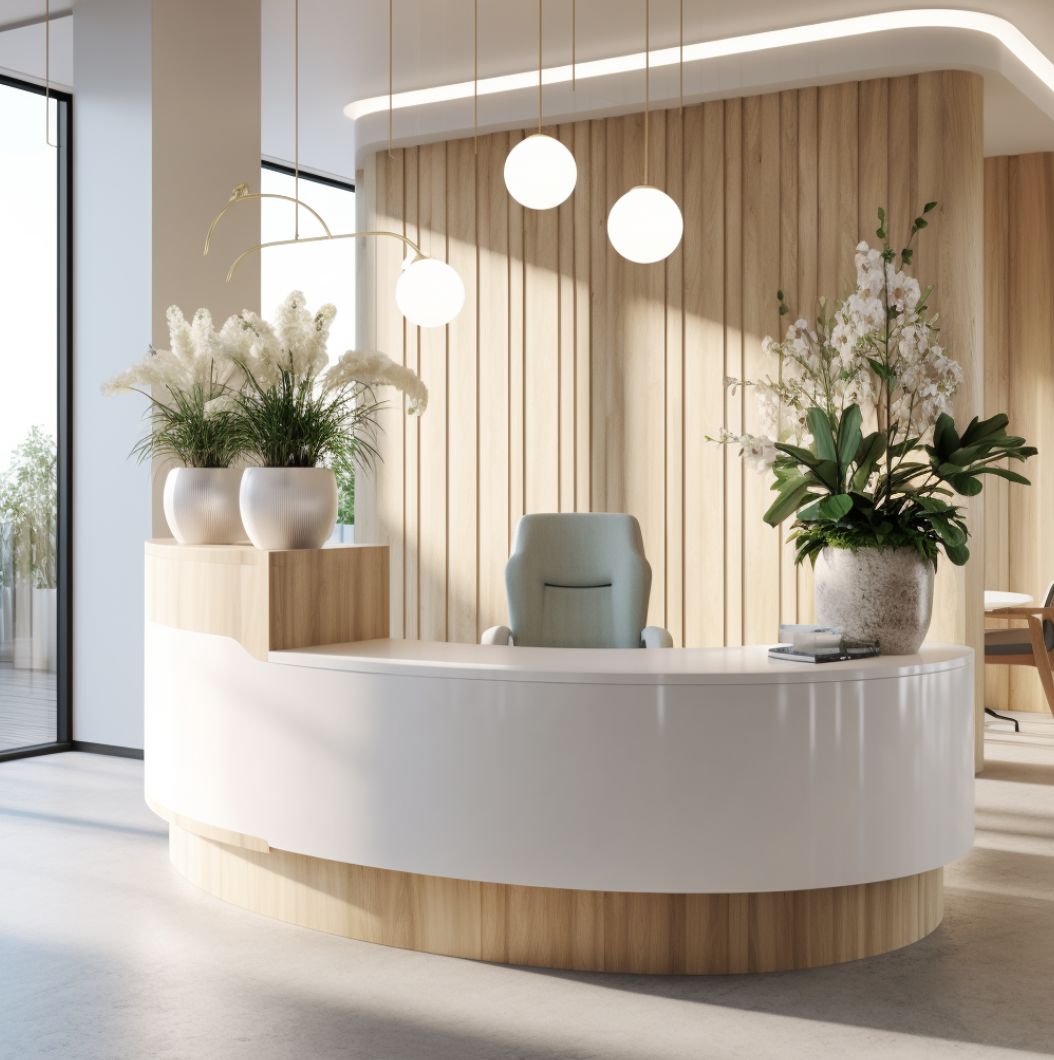
Our design practice focuses on meeting ADA guidelines with a luxury touch. For example, we aim to incorporate wayfinding signs that have a luxury feel to them. We also utilize high end ADA sinks and grab bars in restrooms. We also design custom design ADA reception desks with a lower approach section to accommodate wheelchairs. These desks are created with a high end look and feel to them, so they blend nicely with the rest of your clinic or office.
How to Cater to the Needs of Neurodivergent People
Neurodivergent people include those individuals on the Autism spectrum as well as people with ADHD, Dyspraxia, Dyslexia, Dyscalculia, and Obsessive-Compulsive Disorder. Neurodiversity marks a difference in the way a person’s brain processes sensory information. Supporting these individuals does not need to compromise the design aesthetic but does need to involve careful consideration.
One element to consider is lighting. Many neurodiverse people experience high sensitivity to light. Utilizing low indirect light and avoiding exposed LED or fluorescent light bulbs/strips are effective ways to create a passive, non-stimulating space. Window coverings are another opportunity to control the amount of light in a space.
Providing opportunities for movement and flexible seating is another strategy to support neurodivergent people in your practice. Rocking chairs, bean bags, and pillow piles are all unique seating options that provide opportunities for people to regulate their bodies outside of a standard chair. For staff, consider treadmill desks, sit-to-stand desks, balance ball chairs, and kneeling stools as options for seating.
The last recommendation is to bring nature inside. The sights, sounds, smells, and touches of nature are powerful in decreasing stress. Layering these strategies further increases their potency. For example, consider playing birdsong over the speakers instead of music, decorating with live plants, installing a nature-inspired fractal patterned wallpaper, and diffusing a custom blend of subtle lavendar and patchouli essential oils.
Integrating Technology as an Act of Accessibility
Our final thoughts on incorporating accessibility into your health care space revolve around technology. Many people with disabilities use assistive technology in their daily lives. Examples of assistive technology include noise-cancelling headphones, fall sensors, screen readers, and iPads with Augmentative & Alternative Communication software. That is not to mention the nearly 100% of people entering your practice who will be carrying their cellphone. Including outlets and charging stations in your waiting room can add an extra layer of comfort for your patients who may need to charge their devices as well as provide accessibility for your patients or clients with disabilities. These outlets don’t necessarily need to be isolated to the wall. Installing bench or couch style seating that has outlets integrated into them is another option.
Healthcare check-in kiosks are another technological solution that can not only promote accessibility but streamline the practice’s workflow. They can reduce the administrative burden on staff and also decrease the number of interactions necessary for those with mental health disorders, like generalized anxiety disorder or PTSD, who may desire less face-to-face communication with healthcare personnel. Check-in kiosks additionally limit the amount of writing necessary for filling out forms. Eliminating writing creates more accessibility for those with arthritis, muscular dystrophy, limb differences, and dysgraphia to name a few disabilities this would benefit.
Do you see the value in making your space more accessible but not sure you want to tackle it on your own? Let the experts help! Our design team is based in Raleigh, NC and will happily customize beautiful luxury design tailored to your healthcare practice that is also accessible. We offer full-service design for practices in North Carolina and online design services for any practice in the United States.
Want to learn more about how to incorporate accessibility into your medical office?
Book your free 15-minute discovery call and let’s discuss how we can can best serve you!


